(last edited on February 15, 2023 at 12:26 pm)
![]()
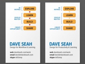
![]() When I was working on my website yesterday, I wanted to replace the ugly black “default thumbnail” that appears for graphicless posts with something a bit lighter. I remembered my old SEAH MICRO logo from a few years ago, dusted it off, and made it work as a stand-in. I actually like the logo a lot, and realized that it might be a good fit for me now.
When I was working on my website yesterday, I wanted to replace the ugly black “default thumbnail” that appears for graphicless posts with something a bit lighter. I remembered my old SEAH MICRO logo from a few years ago, dusted it off, and made it work as a stand-in. I actually like the logo a lot, and realized that it might be a good fit for me now.
I added the words explore learn build share, which appeared in my 2012 business cards. I think it works nicely because it matches the four bubbles, which have a cyclical arrow thing going on to represent iterative process while evoking a science-like association with 50s-style atom bombs. Also, the bubbles are a familiar element of my form designs.
 I tried a few levels of boldness for the davidseah.com text, settling on the last variation as a good balance. I can imagine this design working well as something engraved on a metal plate or a stamp. I guess I’ll have to see what it looks like when I design some test packaging around it. The graphic at the top of this post is just a quick visualization to see if Photoshop had added improved 3D texturing capabilities (it doesn’t seem to have), but it doesn’t look right. Setting up the same project in Modo, the 3D modeller I have a license for, might be educational! The background texture is from a website called texturelib.com that allows use of their assets if credit is given. They have a lot of nice textures to work with.

0 Comments