(last edited on February 28, 2016 at 5:06 pm)
Yesterday I made an infographic diagram of my “ideal” day broken down by six types of activity. I was in a playful mood, and had pretended I was a manufacturer of high-end data processors, including myself as part of the product line. Of course, I needed a manufacturer’s logo.
It immediately occurred to me that if there’s any graphic that’s associated with me, it’s the bubble-based data entry I used in my productivity forms. The idea of making a retro logo that borrowed elements of the 1980s microcomputer and high-end audio companies came instantly to mind.
Here I can go a bit more into the design.
There wasn’t any sketching at first, as I knew I wanted the following elements:
Four bubbles, of the style I used in the various Printable CEO forms. The ones I used are actually a little taller and a little closer together than I would do on an actual form; this is a concession to creating a stronger group that read as a single unit. If these were actual bubbles on a form, I would space them farther apart to make “bleedover” less of an issue. You don’t want to require too much precision on the part of users, otherwise hands cramp up and it gets harder to read which bubbles are filled in due to the “hanging chad” phenomena.
Feedback loop, because feedback is everything. I had a strong sense that this would create motion in the logo, plus add a bit of dimension.
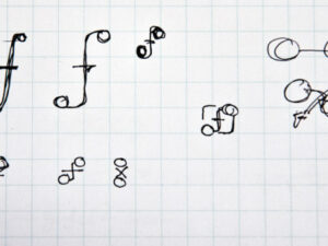
The top row shows the three iterations I made from left to right. Blue and orange is a color scheme I use a lot, so I thought maybe it would be cool to have both of them in place. However, I felt it created too much separation between the logo elements. The final design of the stroked arrows pleased me also in that they are reminiscent of the symbol for an inverter or op-amp; these are kinds of electronic components used to create circuits.
I decided to make everything one color, with the feedback line using a tint (65%) of the color. This would make it easy to print using a single spot color, light or dark, which is a common practical concern when designing for paper. The lighter tint isn’t even necessary, as there are cuts in the linework to make the line stand out from the bubbles.
 One variation I tried (not shown here) is an italic typeface. I didn’t like the way it unbalanced the very balanced feeling of the 4 bubbles, so I left the font as semibold Proxima Nova Condensed (the official David Seah typeface) with a tracking of around 450%. I’m not actually that happy with the weight and spacing, but I decided to live with it.
It’s a simple logo, but there are a few little touches I threw in. The feedback look is purposefully drawn a little lower to help the logo feel more weighty. The gaps between the lines in the foreground are a little wider than the ones in the background to help with the perspective cueing (they look a little farther away, which is kind of a visual trick being played on an otherwise-flat design). Likewise, the rear arrow is a little smaller the the front arrow, which points forward. Not only does this add to the feeling of dimension, it also emphasizes FORWARD motion over rear motion. The point of feedback and assessment, after all, is to move forward with your goals.
After getting to the final revision (total time was about an hour), I converted the stroked linework to outlined shapes, removed white fills (in the arrows) so I could place the logo on any color background. I converted the text to outlines so the font didn’t need to be installed on whatever computer I was using. This took another 30 minutes to get just right. While Row 2 looks the same with the exception of the slight difference in stroke color, Row 3 shows how the shapes are actually constructed.
I was curious whether my memory of 1980’s logos for microcomputer and high tech companies was accurate…I had the feeling that the logo wasn’t quite retro enough. I grabbed a collection of logos off the Internet from that time period and placed mine with them.
 I can see right away that my logo is using finer lines and gaps than any of the 1980s logos, and that condensed fonts were not in back then. If I wanted to go back and make a more retro version of the logo in a reproduction catalog, I would have to thicken the lines considerably. I wonder if the logos then had to account for cruder printing resolution in magazines, and deal with low-quality box printing. My logo also has more elements in it than the other logos, making it look overly fussy. It reminds me more of the 90s, when people started adding florishes to logos to make them look fancy. The adherence to simple shapes, though, seems to be generally compatible, as does the squat proportions.
In any case, as a logo it isn’t too bad. I feel that there is another step of refinement that could happen. Perhaps bulking up the linework a bit would help, or adjusting the bubble spacing.

0 Comments