(last edited on February 15, 2023 at 12:27 pm)
 SUMMARY: I am picking hardwood floor samples for my living room so I can turn it into a private coffee shop. If you like looking at color swatches accompanied by obsessive detail about the application of color theory, this is the article for you!
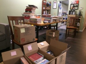
When I last wrote about turning my living room into a private coffeeshop, my so-called “The Living Room Cafe” project, I was stuck picking hardwood for the floor. Currently I have 30 year-old carpet, and since my living room is not large (13×20 feet), solid hardwood flooring might be affordable even at $7 and up per sqft, plus cost of install and carpet removal for about $3-4 per sqft. Still, since this is the floor and IT IS FOREVER, I’ve been kind of paralyzed about the decision. The floor sets the entire tone for the living room cafe. I had made some progress last year on some color studies, but I got hit by unexpected major repair bills and had to set the LRC aside.
Fast forwarding to today, I’m seeing the LRC as essential to helping me create essential connections with my peers. I’ve come to believe that this is not an optional “would be nice” thing to happen if I want to have a fulfilling experience. I need external motivation and connection to do my best work. The Living Room Cafe project will be, I believe, a critical part of making connections possible by allowing me to be a host of a selective co-working space. To quote Val Kilmer’s character from Real Genius, it is a moral imperative!
Checking out the local flooring specialists
With moral imperatives and visions of happy co-working in mind, I went to renew the project with Bridget at Gregory J Flooring, a local business that had been recommended to me by several super-fussy friends on different occasions. As I am someone who also would rather do work based on quality rather than competing to the bottom by being cheaper and faster, I am willing to pay if the value and attention to detail is there.
I looked at lots of samples and relayed my vision to Bridget, who offered additional insights into what else I might consider. She remembered that last year I had been looking at very light floors, while this time around I was looking at very dark floors. My reasoning for the change was that I have quite a bit of black computer and A/V gear, with their attendant cable mess, and since I was planning on buying inexpensive black commercial restaurant table bases, a dark floor would help hide that better; lighter table tops would then draw the eye away from the floor. She thought this was a reasonable thought, and also suggested that with a light floor, the only option wasn’t to go super-light on the walls, but to also go with bold colors. This I hadn’t considered. She then suggested I take the big floor samples home overnight so I could see them in the light of my actual living room. Since I’m keeping a lot of existing furniture, I also needed to see if the floor would work with it.
Reviewing my selections
I narrowed down my take-home selection to a couple of dark wood samples. For variety, I also took a picture of a very light-grained Maple.
The first dark wood sample that had caught my eye was Makaha Wave from Preverco, using yellow birch stained a dark coffee-like color with some uneven surfacing to give it some character.
 The second sample was a slightly redder hardwood from Mercier, their Puerto Cabello made from some kind of exotic wood.
The qualities in common were a tight grain, dramatically dark with a slight red tint. That’s important because my existing furniture leans that direction, as shown here
 As I was talking to Bridget, I noticed that the samples I selected possessed a subtle pattern of swirls due to the knots that wasn’t obvious on first glance, but I think helps add visual interest. In general, I avoided middle-tone, high contrast grains because I want a “clean coffeehouse look”, sort of like a Starbucks.
When I reviewed both samples in my own living room, I immediately liked the Puerto Cabello better. Not only is it slightly more reddish, it has a deeper grain and appears more luxurious. It’s a more expensive wood (estimated at around $10-11/sqft). I didn’t like the Makaha Wave’s surface variations as much at home, and also noticed that there was a lot of light-colored grain showing through, alternating through light wood, black stain, and brown-red stain. Perhaps the underlying yellow birch doesn’t take to the dark stain well. It looks kind of cheap and painted-on when compared to the Puerto Cabello. The alternation in colors was between just two main colors: black and dark brown with a tint of red. On the other hand, it is $3 cheaper per sqft.
After taking back the samples to Gregory J, I talked to another rep to set up a complimentary “measuring”, which will be used to give me an exact quote. I was a bit concerned about the price difference since it would exceed my budget, but having an exact assessment to base the quote on would be a positive step forward. In the meantime, I could continue to search for a more affordable hardwood or engineered hardwood product that might fit my needs, now that I had an idea of what I liked.
Assessing color harmony
On the drive home, I did the math and realized I had around 280 sqft to cover, not 400 sqft, which gives me a budget of around $12-14/sqft for everything. However, going cheaper without compromising long-term satisfaction would be desirable still.
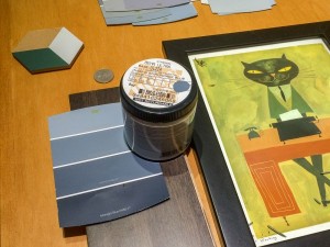
I decided to process the sample photographs I took and make some color studies, starting with a hard maple. The following pictures will not show exactly the same colors I’m looking at because of variations between individual computer displays, but I’ll explain what I was seeing and thinking.
Hard Maple / Light Floor Alternate
 Before I review the first sample, I should explain the color swatches.
- The sizing of each color swatch is an attempt to represent how much color is visible in proportion to its application in the space. Walls are huge color areas, and so you have to desaturate them a bit in large applications.
- The MAIN WALLS swatches are the largest application of color. Two of the swatches are the same, though they may appear different. The third swatch is the accent wall color wall that goes behind my computer.
- The ACCENTS colors are possible spot applications of other things in the room, perhaps the door to the basement or a panel inset in my bookshelves. The baseboard at the bottom of the wall will probably remain white. The black accent colors correspond to the restaurant-style table bases.
- I have pre-existing FURNITURE that is the same no matter what floor or wall colors I pick. These are on the right. My standing desk is white with silver hardware with a bunch of black computers and stereo equipment underneath is. My dining room chairs are the orange color, and they’ll be redistributed to the small tables. Finally, my floor-to-ceiling bookshelves and some accent furniture is a cherry. These colors are probably more saturated than they are shown.
It’s hard to choose colors because color vision is so subjective. Take a look at the two identical “main wall” colors. Does the middle gray next to the blue look slightly darker? It isn’t. That’s your brain playing tricks on you. Despite this, I can make a first pass at choosing colors if I understand that I’m exploring subjective color relationships in the context of a specific image. For example, this picture was taken at Gregory J Flooring by a big plate glass window on an overcast day, so the colors of the wood are a little muted and are tinted toward blue. I tried to adjust the brightness so it looked like the wood as I remembered it, but this is also completely subjective.
Now let’s look at the actual picture!
The general idea behind the main wall selection was to be a slightly blue dark gray, which will allow hung artwork to pop against it without being affected too much by the background wall. The blue I picked balances nicely with the yellow of the maple finish.
The accent colors I’ve picked would be used for larger features in the office, though I’m not sure for what exactly. Table tops? Napkins? Boxes? The palette feels like a lively but somewhat more sophisticated “adult primary color” set. The accents and the main colors are all pretty evenly balanced with each other in brightness, so none of them really overpower the other.
If I had a lot more space, I think I could pull off this color scheme, but my room is not very wide and I think one would need a pretty decluttered room to pull it off the light floor and NOT have it look like a nursery.
Makaho Wave / Dark Stained Yellow Birch w/ Surface Variation
 This is a coffee-colored wood stain. As I mentioned before, the Mahala Wave is yellow birch underneath, and you can see the light base wood color between the dark stain. The engineered surface imperfections hide this to some extent, but it still looks like a thin layer of stain instead of wood richly imbued with color. Although these details fade away when you are looking at the floor from a normal distance, it’s not as satisfying to me from a materials perspective.
I tried the complementary color strategy I had used for the hard maple sample above, but this wood is actually fairly neutral. It’s almost gray, with a very very slight lean toward a rose-pink color. This may be due to the light-colored wood showing through as I noted above, or I could just be imagining it. Rather than try to find a light blue shade, I thought maybe I’d use a “similar color” strategy instead by choosing harmony with the coffee brown. The main wall colors are a slight cream/caramel color, which works with the wood instead of contrasting with it. I chose a blue accent wall again, a little brighter than the base wood color, but not so bright that it calls too much attention to itself. The accent red and green are contemporary coffee shop, and they match well with my existing furniture swatches. You’ll also see that the black accent color, which is the color of the table bases, practically disappears against the dark wood. That’s exactly what I want to happen; the accent colors and whites will be what draws the eye, not the contrast of a black base against a light floor. In theory!
I actually like the way this came out, and it has me thinking that maybe this selection is usable after all.
Puerto Caballo / Dark Stained Exotic Wood in Satin Finish
 This sample picture was also taken at the flooring store. Unfortunately, I didn’t notice how dusty the sample was until after I started processing the images for this post.
Compared to the Mahala Wave, the Puerto Caballa is even darker, with a more noticeable reddish tint, and is made from “exotic wood”. It looks like luxurious tight-grained wood with enough swirly variations in the grain to make it interesting, like a double-dark-chocolate cake. This wood also doesn’t have that weird high-contrast light-grain dark-grain look.
With more reddish tint to complement, I picked a blue base. The picture may have affected my choice of blue. I chose darker gray walls that are still quite a bit lighter than the floor. It’s hard to see here because of all the reflection from the big window making the wood look quite bright, but perhaps this is something one must anticipate as well.
The blue and the red accent are a little more muted; the red in particular has picked up a touch of dusty blue and is designed not to compete too much with the accent blue. The accent green, however, is purposefully brighter because I thought SOMETHING needed to stand out in the space, and green has a nice “spring” feeling to add some life to the palette.
This isn’t a bad color scheme either. It feels a little more serious and a little more masculine, with the spring green keeping it from getting too heavy. Looking at the background picture, though, I am also pretty sure that it should be a little more reddish in tone; if you look at the second image in this post, the Puerto Cabello is the sample on the right and it’s noticeably redder than the Mahala Wave. Yet, these two images seem to show the opposite. Sigh. UPDATE: I reprocessed the background images.
So…what’s next?
While these color exercises haven’t really helped me pick final colors, they have taught me something: I can probably make either floor work, so I could save money with the cheaper hardwood or ANY wood if I wanted to. That’s a huge relief.
I scheduled my measuring for Tuesday the 12th, so perhaps by then I’ll be ready to select a wood and move on with the project!

6 Comments
Just spotted this blog through a post on your Facebook feed :)
Looking forward to watching this project develop. It’s a fantastic idea and you are lucky you have a large enough space to work with that the dark wood floors won’t make the space feel too small.
I agree with your point about the swirls in the wood adding visual interest. I love writing in coffee shops and adding additional sources of inspiration is a fabulous idea :) Have you any plans to add any sort of artwork to the walls? I have found that they are a good way of breaking up strong colours and adding other sources of visual interest to the space. (I added this feature wall to my bedroom this year – one of my first forays into the world of DIY – http://mrskirstyholl.blogspot.co.uk/2015/02/jan-2015-resolution-update-reorganising.html)
Hiya Kirsty! Thanks for the comment! I hope my space is big enough for the dark wood floor to work (it’s only about 13′ wide by 20′ long). I’m a little nervous about it still. I’d looked at a lot of pictures of spaces with light-colored floors, and noticed that they all had much taller ceilings than I do, and also big open windows. I’m hoping that the room can still feel good with light colored walls and a dark floor. It might feel like a more intimate workspace, which is fine with me.
I am planning on using some of the walls for artwork from local artist friends, and some of my own favorite works. I like your feature wall idea a lot too…will definitely have to think of how that works!
Hi Dave! Glad to see that you are moving along with the LRC project! I’m chiming in to offer a first hand perspective on having dark wood floors – my whole main floor is a dark brown. Before this, we had only ever had blond hardwood floors. After five years with dark floors, I can say this: Never again!! They show every (EVERY!) speck of dust and footprints and need cleaning so much more often that lighter floors. A variegated floor or light floor is much more forgiving, and much more practical (unless you fall into that odd group of people who like washing their floors every day or every other day).
I realize you are going for a particular aesthetic, and dark floors are all the rage the days…. Just pointing out that they are a lot more work to keep clean than light floors, in case that factors in to your decision making. I’ve basically accepted that my floors will look dusty and dirty all the time, except for the first 3-6 hours after they are cleaned.
Hi Karen! Thanks for the practical advice! Bridget, the consultant at the flooring company, mentioned the very same issue with keeping the floor clean versus the lighter-colored floors. I didn’t really know it would be so difficult! I definitely am not in the “wash floor every day” category of person. I might try out a Roomba robotic vacuum cleaner, if I can at least keep the floor clear of junk! That’s a major goal for me in the new living room…I’ve been slowly clearing it of junk.
But I’m dying to know…does the dark floor look amazing? How did you like the look of it?
Well, the dark floor (when it’s clean) certainly looks nicer than our blond hardwood floors did. They definitely do “anchor” the space visually, and they contrast with dove grey walls and white baseboards beautifully. From a psychological standpoint, the dark floors make the space a lot more “cozy” than the light floors ever did – I always felt like the light floors left the room feeling on the cold side in winter. We had seen so many show homes with dark floors, and we didn’t ask any one about what they are like on the practical side…. If we had, I think we would have preferred a lighter (or even medium toned) floor.
We have a dog and four sets of human feet that mess up the floor …. If it’s just you in the house, the floors might not be as hard to keep clean, and a roomba would be a great solution. But it all depends on your tolerance for dusty floors. I’ve learned to live with floors that never look clean because I’m not willing to wash them more than once a week, whereas our next door neighbour washes hers daily. Friends have the engineered floor surface (it looks like it’s been carved and has really wide flat grooves in it – just google engineered hardwood floor photo), and it is actually a bit more forgiving on dirt and scratches than the regular pre-finished hardwood floors because the reflective surface is more irregular. It costs more, but might be worth investigating as well.
Thanks for the detailed followup, Karen! I only have the two feet, but I have two hairy cats, so I might see the same cleaning challenge. My tolerance for dusty floors is probably your typical bachelor level of dust, as in, “what, there’s dust?” :-) I like the idea of the sculpted surface having variety in reflection helping…that’s a great observation. I think as I design the furniture arrangement, I’ll have to keep “ease of cleaning” in the forefront.