(last edited on November 3, 2016 at 1:44 am)
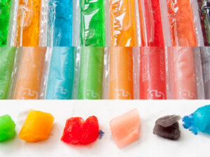
 Continuing my effort to pick some “branding colors” for future Dave Seah products, I combined my love for artificial fruit colors and trends in my own work patterns to create an initial starting palette. I was inspired somewhat by the new IOS7 Photo App Icon, which has a flower-like pattern of bright colors. While not exactly fruity, I liked the luminous quality and “even” spread between the colors.
In my palette build, I started by creating a spread similar to the Apple one, and then started adjusting the colors so I would have a suitable artificial fruit feel to it. I’m actually not sure how close I got to them because I did the work on my old Macbook Pro, which has terrible color fidelity. What I tried to do was to meet the following criteria:
- A distinct dark color and a distinct lighter variation that worked with it. This is trickier than it looks; you want to make sure that there is a slight hue variation otherwise you end up with a chalky-looking pair; the classic noob mistake is just to add black or add white.
- Each color was evaluated for how “tasty” it looked in a particular fake food group. Was the purple appropriately grape soda-like? Was the yellow working as a lemony indicator?
- I evaluated the colors for overall tonal uniformity between the dark and light groups. The darker hues should all be approximately the same tone (as in “brightness”) if converted to black and white. Not only does this help make the conversion of a color piece to black-and-white slightly easier, it also ensures that there’s adequate contrast between foreground and background colors no matter which hue I pick. I need to make a second pass at this with some actual test designs, but that can wait until I start designing a first round of packaging.
- To further ensure that the colors would read as a group, I applied a 15% multiply of a light reddish hue across all the colors. This is a dirty trick that simulates colors under uniform lighting of a certain color temperature, and it has the effect of making everything look like it is of the same time and place. I also checked the blue variation to see if I liked it better, but ended up picking red because a bright ORANGE color is very important in the Dave Seah color universe, and red tints accentuate it. A blue tint would tend to muddy the orange, being its color complement.
- I picked three grays that would read as gray, and then checked against a black background.
This is a decent first pass, but I will have to check the colors again against a better monitor. Once that’s done, I can pick Pantone reference colors and create a CMYK variation. The branding colors are leaning toward 5 groups of fruity dark/light hues against a deep gray that is very slightly blue (this would work great as a rich black ink mix) to help the red-tinted colors contrast even more.


0 Comments