(last edited on December 13, 2018 at 8:45 am)
I recently had the chance to make a desktop wallpaper for my Internet bestie Colleen Wainwright, who in celebration of turning 50 is running an amazing fundraiser for WriteGirl, the LA-based non-profit of women mentoring teen girls in writing as a technique for self-expression. I think this is a very fine thing indeed, so I was happy to volunteer a desktop wallpaper.
Of course, I’d forgotten that I really don’t know how to illustrate. I’m something of a frustrated illustrator; I love illustration and illustrators, particularly writer-illustrators. It’s one of those mastery deals; the more time I put into it, the better I get. My mastery time went into computer programming and journal-style writing, and not so much into drawing cool stuff. It’s never too late to get a little bit better at something you want to do; it just takes the plastic mind of a child and the perseverance of someone who can see the promise of greatness in what they’re doing. I remind myself to have a little faith, because greatness could just be one more push away. And if there’s anything I’ve learned about creativity, it’s that the final result is often not something you would have expected.
Colleen provided a couple of inspirational themes to pick from, and I picked this one:
“Any time I see someone succeed I am happy, for it affirms my belief that I live in a world where success is possible.” — Bonnie Gillespie, writer and casting director
That’s something I can believe in! I had visions of golden doorways of opportunity and infinite halls of possibility, populated throngs of smiling people. So I picked it, trusting that I could wrassle the concept into something doable in about a week.
DAY 1: THURSDAY
I had been thinking about fancy doors with onion-shaped arches, like layers emanating out, waves of possibility. I also found out who Bonnie Gillespie is, having stumbled upon an interview with her on the 50by50.us website. She’s a real person. Still alive! Which makes it even more interesting, as she is one of Colleen’s real-life inspirations.
Anyway, I wasn’t sure how the onion doorway really fit, other than I could see it being an interesting pattern geometrically to make. A doorway of opportunity is success, perhaps. I thought of sandstone arches against the bright desert sun, like Abu Dhabi in 1960s issues of National Geographic.
I set that aside, first going with my writerly instincts to break down the quote so I could get inside it and find my spot:
| Any time | it affirms |
| I see | my belief |
| someone succeed | I live in a world |
| I am happy | success is possible |
ANY TIME. AFFIRMATION. SEEING. BELIEF. SUCCEED. A WORLD. POSSIBLE.
I SEE / AM PART OF A WORLD / AFFIRMED / HAPPY
RECURRING.
It’s a kind of personal, spiritual statement of belief. It’s not so much about how wonderful it is to see people succeed as being wonderful in itself, though that is perhaps implied. It affirms a belief in the world that it allows success. And this supporting fact, repeated, reaffirms. The implication is that it is sometimes possible to forget or lose faith. The value of happiness is tied to the recurring of the observation of someone else’s success.
Now, I have to contrast this with my own view of the world. I picked this quote because on first glance I thought it mirrored the way I think. But would I say exactly the same thing? What makes me happy? It will be in the interplay of those two perspectives that I think the inspiration for design will be born…
Well, hm.
I like to see people succeed. I like to see people with dreams they dare not share, for fear of being ridiculed, suddenly burst into the possibility that it is achievable after all. That they are not alone, but at the same time it is up to them. I like to see people who start to let their dream show, inadvertently, because they find it difficult to contain their excitement about it. I like to see people grow comfortable with their dreams and learn how to work with them, bring them into the light, and then reap the happiness that this brings them. If I can somehow be part of that, I’m happy. I think for me, the happiness stems from both feeling like I’ve been a positive contributor, and that it’s easier for me to believe I can achieve my dreams if other people can as well. But there is also something that genuinely makes me smile when I see someone excited about their own passion, when they cross that long shadowy threshold of uncertainty and blossom in the light on the other side, which they discover has been inside them all along. SO HAPPY this makes me!
So I see the similarities here. I can insert my reasons into the framework of the quote.
Darkness / Light. Epiphany. Blossom. Threshold. Happiness. Unification with the Possible and the Self with the Dreams
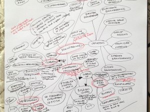
With something of a conceptual framework in mind, I felt that I could do some sketching. In 5 minutes I sketched the following concept:
 I was thinking of using mostly grays and light in a kind of 2D mural format, with lots of arches and doorways of opportunity, and people passing things back and forth in various stages of success. I’d like the idea of a creative community to come across, interrelatedness, and the joy of making and being part of something that’s bigger than any individual. Maybe the symbol of success will be totem poles, as they can be highly individualized.
How to illustrate this? I needed to draw doors, people, and perhaps have an interesting style of person. It’s the kind of thing that can develop after doing some small fragments; I just needed to push to completion once, then twice; the third time is usually something that holds together, I’ve found. First, some image research:
- I next spent about 45 minutes or so looking at reference for cave paintings and friezes…ok, the Mayans had an interesting hieroglyphic system. The Aztecs didn’t really have one. The Egyptions seem just a little bit stuff. I think about spending some time developing a 2D character look that I can illustrate fairly quickly. That will be mostly a game with proportions, I think, and having a 2D body representation that can handle reaching up, reaching to the side, and reaching down.
- I looked at one of my favorite Pinterest pinboards: Doorways, and sketched a few for reference.
- What kind of HAPPY do I want to portray, though? It’s a kind of beaming, genuine “I’m glad to help” and “glee!” and “hey, it’s working!” vibe. A quick Image Search for “happy” and “smiles” might show me the way such a look could be…wow, googling “happy face” and “happy” and so forth brings up a pretty grim collection of fake-looking happy faces. It occurred to me while I was searching, though, that cartoonist Chris Baldwin knows how to draw a smirky pleased-with-self face on his alien creatures. And cartoonist Phil Foglio also knows had to capture mad glee. So…a trip to their archives is in order! But that will have to happen when I get home, because the Internet at Starbucks was being of slow and crappy.
Before quitting for the day, I opened up Illustrator and sketched out a quick concept of how the screen density might be, a kind of sketchy-layout so my visual brain had something to react to and contemplate overnight:
 Was it too regular? Should it be light or dark? How many kinds of doors do I need? Is the scale right? How big should the people be? The purpose of this sketch was just to kickstart those questions, the “sacrificial first draft” that helps steer the visual decision making process. Much easier than trying to do it all in your head.
DAY 2: FRIDAY
I spent a few hours drawing various doorways, and arranging them in Illustrator to see how I could marry the concept with the quotes.
 I was just not feeling it, though. Doubt begins to set in…is this the right approach?
I took a step back and revisited the quote, examined the state of my heart, and projected the feelings onto the design I saw on the screen to try to find a jumping-off point. I didn’t see it. I decided to take a break.
DAY 3: SUNDAY
I spent a few hours drawing flowers in Illustrator, and then doing a light study to see if this would help jazz-up the desktop concept:
 The idea was to see if beams of light, representing the light of opportunity behind the doors, would add visual interest. It sort of did, but it didn’t grab me either. In fact, it just raised more questions:
- Should a door of opportunity be open or closed?
- What about the people? Do they go inside?
- Isn’t this starting to, uh, stink?
- I’m still not feeling it…the concept is starting to lose its shape in my head.
The desktop wallpaper project was, I had to admit, far more complicated than I had imagined, because it puts pressure on several areas:
- I want this to be really good
- I want to create something original with hand-made details
- I want to create something that is authentic, moving, using sources that are drawn from within me.
I’ve always, I think, approached my more personal projects like this, but as this project is for someone else I am feeling the added pressure not to disappoint. This brings in still more pressure and stress that doesn’t need to be there.
I decided to take a break. This would delay the delivery of the wallpaper by the soft deadline, which sucks, but I needed to regroup. I took Monday off from the project to work on something else, to let my creative energies rebuild, and tried not to feel like I’d already failed.
DAY 4: TUESDAY
Here’s an important concept when doing creative work, one that I may not have been fully aware of until I started journaling my process extensively: the concept of the creative hop. The first creative hop on this project was to think of the concept, come up with an idea, and then start doing it with creating the structural pieces that would carry the message. But the pieces ended up not being that great…at least, not in the way I’d hoped. Thus ended that creative hop. It’s time to begin a new one.
For any creative project, there are MULTIPLE hops I should plan for. Ideally, you learn a little from each one, and converge on something interesting. Unfortunately, since I hadn’t exactly planned on this, I’m now behind on this project. I had only myself to (lightly and kindly) blame; I’d planned the project more like a cut-and-dried programming job, where the right answer is the answer that works. Solutions converge rapidly. Not so, when doing creative visual work.
So…deep breath! And take that second hop. Possibly one of many. Gotta have faith, and keep moving.
One thing I learned in art school, by sheerest accident, was that dramatically restricting the focus on a concept can yield much more powerful focus. This is more of a graphic design / composition principle. Whereas before I was thinking of creating a complex piece that would be fun to look at, like a “Where’s Waldo” or “Richard Scarry’s Busy Busy World” style illustration, now I was thinking more like a graphic designer:
- What’s the message?
- How can I deliver it in one glance?
I also realized that working in Illustrator is very frustrating. I am passably proficient in it after all these years, but it has never been my first choice; I preferred Aldus Freehand, the much-lamented former competitor to Adobe Illustrator before Adobe bought ’em out, for its much-less finicky drawing interface. Don’t get me started…I can already feel the veins starting to pop out of my head…but I digress.
Having acknowledged that Illustrator is frustrating, I realized I was probably going to finished production tools too early. I should have developed a more finished sketch first of the various concepts. I decided to start again, this time with sketching on paper.
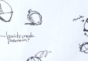
I took about 45 minutes sketching on a piece of paper in my notebook, moving rapidly from concept to concept:
 There are four concepts I thought were viable: a green grasslands with flowers growing up toward the sun (this could be a simple shape exercise), a monstrous toothed mouth with a light at the end of it (symbolizing that the way out is through the monster’s throat), two charged sphere with a spark arcing between them, and a retro Donkey Kong-like diagram showing the world as a game, and defeating all these obstacles to get to the top (overcoming! success!) This latter one I liked, because I really like old video games (conceptually, at least) and this was something from ME that I could imbue into the quote. Which got me thinking again about sparks; for me, the part I like the best about seeing people succeed is seeing that a-ha! moment spark in someone’s eyes. I love that moment, and it’s what I really live to see.
So, I decided to do a quick test to see if the two spheres sparking would work. For one thing, it was by far the quickest thing to test, requiring no illustration other than the spark. I also, in my earlier Illustrator frustrations, had remembered the one thing that I had liked about it back in 1995: the gradient tools were much better! So I got caught up in playing with gradients and blends, trying to get them to look interesting. Here’s the first draft:
 And…it worked for me. There is something about the murky blue deep, the spark, and the size disparity between the looming sphere above and the smaller sphere below. I put the larger sphere on top so it would weigh down the frame, a standard compositional trick used in film, to create some sense of tension that is released in the bright spark.
There is a kind of pleasing ambiguity in what is happening too, so it is up to the viewer to make a decision about what’s happening. This happens to match the feeling of the quote, which itself is fairly general. You can read into it what you want, make up your own back-story, come up with your own rationales. The abstractness of the desktop felt like a good match.
Now, I just had to get the typography under control. I tried several variations of the text, applying pseudo 3D trickery and other such nonsense…


 …before sending this one to Colleen for her (gulp!) review:
 Her comment was positive, and she suggested that to make it more powerful removing the competition between the spark and the text (which I wasn’t happy with anyway) with a simple rim of text in the planetoid. I also decided to fix the “zap surround” with a digitized effect (it’s, uh, computery). It’s a bit of the 8-bit nerd in me crying out.
I sent it off…
 Colleen said she didn’t like it…(gasp)…she LOVED it (whew). Communicating with the Communicatrix is sometimes fraught with verbal trickery. APPROVED!
All that was left was to generate the 8 variations in size (which I’d planned for in the layout), and to eliminate the color banding in the gradients.
Technical Production Notes
Although your typical computer display can show millions of colors, there are a fixed number of brightness values that are visible. When you are spreading a gradient of color over a large area, the limited number of tones available can become visible as “bands”. The problem is exacerbated on cheaper LCD screens, which often have a limited color gamut compared to the old CRT displays.
Anyway, you can see the bands on the earliest variations of the desktop. There are three ways to get rid of these bands:
- Dither them by hand, manually, using the single-pixel pencil tool. This isn’t really a time-efficient option for 8 wall papers, and it’s particularly onerous because Photoshop’s pixel tools have been subtly broken since version 6, and it makes me angry just trying to use them.
- Reduce the area of gradient, so you aren’t spreading the colors over such a wide range. This isn’t really possible to do without changing the nature of the image; it would become more high-contrast, and lose the foggy quality I like.
- The option I picked: add noise to break-up the outlines of the bands.
I did the final compositing of the original vector image in Photoshop, breaking it up into two layers: the foreground elements (spheres, text) and the background (the blue radial gradient).
 Next, I imported the foreground and background as separate Photoshop Smart Objects, in 16-bit RGB mode. Using 16-bit per component mode gives me more tonal dynamic range, which helps avoid banding until I down-sample to 8-bit per component. Photoshop helps by doing a bit of its own dithering in the conversion, but it isn’t good enough to cover up everything. To overcome that, I had to apply my own effect.
I duplicated the foreground layer and applied a Smart Blur and Screen effect to it, which helps add an additional subtle glow. I also applied Smart Noise to each of the Smart Objects; this gives me resolution independent noise, which is important when it comes to scaling the wallpaper up from 1024×768 to 2560×1600. It adds a kind of “grain” the image, which masks the banding effect. It is only slightly visible in the smaller sphere, if you look for it.
Finally, I added an adjustment layer to goose the contrast a tiny bit. In general, the PC is more contrasty than the Macintosh, so I tried to find a balance between higher contrast light detail on the spark and ball gradients and the ambient blue light of the background. Too much and the ambient atmospheric effect goes away, too little and the entire scene would seem a little muddy. To combat muddiness I had used a variety of blue hues; the spark effect is a little more electric than the more deep-sea blues of the planetoids and backgrounds. This helps create a bit of subtle visual separation; if I’d just use the same blue hue and swept it from lightest to darkest, the result would have been kind of dull. Subtle hue variation is your friend when making gradients and complementary colors.
You can see the layer setup in the image to the right. An interesting side effect of using Smart Objects is that the master vector sources are now contained in the Photoshop file, not the original Illustrator files, because Photoshop makes a copy of that data and stores it. You can double-click them to edit the source in Illustrator, still, which is pretty cool. It’s nice also that the duplicate Smart Object layers only refer to a single source.
Now, the reason I even bothered with Smart Objects and working in vector format to begin with was so I could use the same master file to generate high resolution PNG and JPG files. I was particularly worried about the noise pattern getting scaled-up, thinking I would have to regenerate the noise field for each resolution, but it turned out that the Smart Filter feature of Photoshop (which was new to me) took care of that for me.
The end result: a kind of grainy background that gives image compression algorithm fits, resulting in significantly larger files. Visually, though, it eliminates the distracting color / mach banding effects, which was important to me. It should scale up well to wall-sized prints, if I so wanted to do that.
Final Evaluation
I started with a much grander illustration challenge, and sort of ended up with an abstract shape design that “works” purely on color and focus. I could regard this as a cop-out; I could have burned 80 hours on this learning to illustrate the Ultimate Concept, but I had to make a choice regarding efficiency, so I did the simplest concept first. If it hadn’t met with approval, I was ready to move onto the Donkey Kong concept, which I’d already started planning. As it happened, the resulting wallpaper, though far from my original concept, came through to the point that I feel pretty good about it. Next time, I’ll have to plan for many more creative hops, to give myself more time to explore.
You can get this wallpaper in all eight sizes, plus the wallpapers from much more famous designers, at Colleen’s 50 for 50 Fundraiser for a measly donation of $15.00. I know, right? SUCH A VALUE. You could also get the DIGITAL MONSTER PACK for a mere ten bucks more and reap additional Colleen Wainwright exclusives. Be a mensch and help a teenage girl find her writing voice through quality mentorship.

2 Comments
“I had been thinking about fancy doors with onion-shaped arches, like layers emanating out, waves of possibility.”
Your quote plus your sketches of arches above almost made me jump out of my seat. Eerily similar to an arch concept I drew back in 1989. Here’s a rough mockup of what my basic arch looked like.
At the time I was using it for a D&D campaign world I was creating from scratch. Later I fooled around with creating an entire story around it (had a whole epic fantasy plot figured out for it) but I never did anything with it.
Has a Roger Dean artwork type feel to it (i.e. organic, almost egg-like or womb-like).