(last edited on June 20, 2019 at 2:03 pm)
I received a comment about the vertical orange bubble columns, which I use to visually split the day into a morning, afternoon, and evening. The comment was that the reader’s day didn’t align with these periods for lunch regularly, and therefore implied a kind of structure. I didn’t want to add vertical alternating background columns because this seems very busy (see ETT2 Wide Color to see what I’m talking about).
So I made two new alternatives:
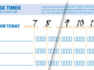
 Revision 3 removes the orange bubbles and replaces the vertical dot lines around 12 and 6 with solid ones to help provide some structure.
 Revision 3A adds explicit times to the form, which looks cool. The back side of the form still uses fill-in bubbles for the time, since people might want to use them to extend either the early morning or late evening.
You can download these revisions on the main ETT 2013 post if you’d like to try them out.
UPDATE: If you’re interested in printed products, take this survey and let me know what you’d like to see.


0 Comments