(last edited on February 15, 2023 at 12:24 pm)
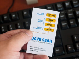
 The other day I made the acquaintance of a fellow who designs board games, and was caught off-guard when he asked me for my business card. No one has asked me for one in YEARS, so I was completely unprepared. I’m also not particularly thrilled with my current business card, which I designed as a 2014 daily challenge:
 Overall I like the simplicity of the card, and for the time my use of my face as recognizable element made sense for my combined professional/online presence in 2014. Five years later, I’m unexpectedly working-through a gender identity transition; I don’t like handing-out pictures of myself that are incongruent with my sense of self (gender dysphoria).
I need a new solution that works with me in-transition, despite not knowing what I’ll look like in the next few years. Like it or not, my face is the first thing people encounter when meeting me in-person and I’d hate to deprive myself of such a useful memory hook. Besides, I’m ALWAYS going to “look like me”, no matter what surgeries and hormonal changes I possibly undergo. Despite my grouchiness, I think the healthy attitude is to accept my appearance and learn how to make positive aesthetic changes! So that’s my strategy for now; I might as well work with what I have and make adjustments as I go.
First Mockup: Resizing the Old Card
As I was looking at my 2014 business card, I figured I should tuck one in my FlipSide 2X wallet, only to discover that it doesn’t fit. Business cards in the US are 3.5×2.0 inches, and my particular version of the FlipSide is designed to hold credit cards. Credit cards use the ID-1 standard, 3.75×2.125 inches. I quickly mocked-up an ID-1 sized version of my old card:
 It also turns out that specialty printer MOO has a MOO size format that is very close to ID-1. This opens up the possibility of putting unique images on every card, something I last did back in 2006 when they only had the mini cards. They were awesome then; why not revisit them in 2018?
Second Mockup: Image Updates
I was originally thinking of putting an image on the back of the card, and getting a new photo of myself for the front. I don’t have a white seamless background here, so I just shot myself against my KALLAX room divider to give my photography buddy Sid an idea of what I was thinking.
The exercise of shooting the reference photo got me thinking about how evolution of myself could be captured in the photo itself, suggesting a new approach.
- In my old card / branding imagery, I always had a yellow Lamy Safari fountain pen. This was one of the props I always carried with me, though I fell out of the habit some years ago.
- I have a newer special edition Lamy Al-Star pen that not only is a vibrant fuschia, but also writes in the same color! This is my favorite pen, so I can just do an upgrade of it for continuity.
- I also have taken to wearing a bowler hat in the past year, as I am yet to find a really nice non-binary/femme hat that suits my face. The bowler hat is pretty awesome, now that I’ve gotten over the fear that I look like an idiot. So, why not add that to the brand imagery?
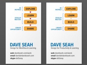
I grabbed a selfie-stick and mucked around with some angles. I accidentally shot the REVERSE version of the photo, being unaccustomed to the Way of the Selfie. This lead to some new thoughts:
- Reversing the angle subtly telegraphs a more significant change when thinking about my business card version as framing in a film.
- I tried adding my self-appointed nickname “Sri” to the name, since I’ve been using it everywhere. It’s a name I use playing online games, coincidentally also from around the 2014 timeframe.
- Showing the background office where I work is actually a nice tie-in to the livestreaming I’ve been doing. I’ve been slowly improving my so-called Living Room Cafe so I could do my physical coworking with my friends at home, and it’s my background set too for video. Why not include it in the card? The MOO cards can take photographs on both sides.
Incorporating all these elements leads to this mockup:
 I like the direct gaze into the camera. It’s a little less wistful and dreamy than the 2014 image, and to my eye it conveys a relaxed surety that I didn’t have back then. If I can still be approachable, that might work. Also, I like the idea of periodically updating my business card images by going with very small runs with MOO; for $20 I can get 50 really nice cards. I don’t think I’ve ever passed out more than 50 cards from ANY print run; even 250 cards is way too many.
Conclusion for Now
So that’s where I am right now. I’ll let the idea percolate for a while, talk to Sid, and see where it goes!

3 Comments
Cool! I love how much effort you put into design. I’ve been using the MOO cards with a different design on each. I don’t go through a lot of cards (as you say, people don’t seem to use them much anymore!) so I get an average of 50 a year, with 25–50 designs. Some photos of last year’s batch: https://twitter.com/redblobgames/status/1058831480611164160 . When giving someone a card, I give them a choice of design (“pick a card, any card!”) and then each design has a story behind it so that’s sometimes useful as a conversation starter. Since I’m only getting 50, I get the heavyweight ones. People notice :)
You might want to think about the power of a smile! It’s something I’ve had to learn and am continually trying to remember, in photos and in personal greetings. Although it feels unnatural at times, because of my particular face, it has a strong impact on how people approach and interact with me.
Keep up the great work! -Cal
Big big hugs and thanks to you. IDK if you’ve talked about your gender elsewhere / this is the first note I’ve seen, but I love and appreciate you even more now! Thank you for everything you share.