(last edited on February 15, 2023 at 12:26 pm)
Today was another day of playing with live streaming services. The past few days I had spent time setting up my YouTube Live Streaming channel, and then making some simple “I AM OFFLINE DON’T WORRY” signs. My friend Kitsune Hazard had made a fancy graphic with a fox on it, and I had become instantly envious. This prodded me to do a little impromptu graphic design.
The first pass I made yesterday for the YouTube channel looked like this:
 Not bad! This was also the first time I had used Photoshop’s 3D Layer feature; apparently Photoshop had added a 3D raytracing engine some time ago, and I had never bothered to try it out until yesterday because I figured…well, it probably sucked :-) But it actually did what I needed it to do which was draw some text at a perspective angle for cheap graphic thrills. It’s an easy way to make an otherwise static image look more dynamic.
Now that I needed a Twitch version, I figured I could reuse the same graphic and change the wording a bit. You could call it “brand consistency” if you wanted to give me some credit for that, but really it was me using my laziness to my own advantage.
Here’s what the modified version for Twitch looked like:
 There are some differences in this version:
I increased the contrast of the grayish backgrounds, and got rid of the white fill. This seemed a little more dramatic (due to the additional contrast) while also being simpler (one less color to complicate things).
I changed the tagline so it reflected the nature of the Twitch Creator Community, which is all about making things and showing your process. The YouTube channel isn’t that specific (at least the way I have it defined).
So this was cool…I even made the same changes to the YouTube offline screen for MORE BRAND CONSISTENCY. And because I thought it looked better too.
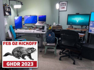
Somehow I got the idea that I should have a different screen for the actually “running show”. Kitsune also has a graphics that gets used when on break, which I thought was very handy. The graphic I use a lot for backgrounds is that “busy desktop” photo I took a few years ago; you’ve seen it on my website header and other profile pages I have littering the Internet. Loaded it up from my collection of images in Lightroom, cropped it to 16:9 ratio at 1920×1080 pixels (HD resolution). Threw it behind the existing Photoshop template I had used for the other signs…and suddenly everything changed. With the busy background, just using a dark screen no longer worked, because the text on top of it no longer had sufficient contrast to be easily read; in other words, the amount of interesting clutter behind the translucent black boxes interferes with the readability of the text. So, going SOLID and BOLD, using a complementary or branded color (my two brand colors are orange and blue) seemed like the thing to do.
Here’s what it looked like after about an hour of noodling:
 This is actually an exciting, unexpected development. The pattern I see in this graphic goes back to other work I’ve done for my website, and it may very well be the basis for my brand graphic style (although I really dislike using the word “brand” a lot…urk). And THIS could influence the packaging graphics that I need to make for my printed stationery. There are NO GRAPHICS on any of the packages; the design of the form itself is part of the “brand identity”, and it happened by accident.
Stuff Learned and GHDR Points Earned
Today I learned a compound lesson. For the last couple of weeks I’ve been feeling like I’ve been burning a lot of energy and not seeing a lot of results from it. After about two weeks of not feeling a hug back from the universe, I was feeling a tad low. But the surprise of today was that creative threads that have been in the making for the past few years came together to suggest a visual brand identity for my products. And I have needed this. And I have also not been very excited to work on it. But suddenly…HERE IT IS.
I think the takeaway from today is that making something every day, no matter how “bad” the technique, there is something that will come out of the effort. Just the movement forward, every day, adds to the pile of experiences that we can draw on. And every once in a while, something clicks. That is what I have to remember. The creative journey is one of uncertainty and surprise. The only certainty that’s under my control is making something new that wasn’t here before. That’s how I can maintain the momentum.
So, what points do I get today. Not a lot of points today…it’s an overhead day!
| PTS | DESCRIPTION |
|---|---|
| 10 | Added a new streaming channel on Twitch. Sorta a product! |
| 10 | Fulfilled a current need! New graphic design for brand identity! |
| 10 | Making a future result possible! With new graphic design! |
| 5 | Helped myself using some old photos! For new graphic design! |
| 3 | I tried something I didn’t think would work! Photoshop 3D layers! |
| 2 | Posted words on this website! |
| 1 | I talked about the work on the livestream |
That’s 41 points, a moderately good day I think. I haven’t yet done the overall “points scored per day” chart, but my qualitative sense of it is that a “so so” day is under 12 points, an “ok” day is 13-21 points, and anything over that is great. An amazing day is over 50 points. A STUPENDOUS day is over 100 points. But we’ll see if that’s true when I get around to doing the point accounting before the next Groundhog Day Resolution Review on April 4.
I forgot to mention that I live-streamed this blog post onto my Twitch channel just to see what it would be like.
About this Article Series
For my 2016 Groundhog Day Resolutions, I'm challenging myself to make something goal-related every day from February 2nd through December 12. All the related posts (and more!) are gathered on the Challenge Page.

)
0 Comments