(last edited on August 23, 2022 at 3:48 pm)
 After finishing my 30 Products in 30 Days challenge, I was ecstatic right until I realized that I didn’t have a place to show them off to new site visitors. As you have no doubt noticed, my website is kind of a mess; it’s difficult to find things even if you know what you’re looking for, and new visitors find it difficult to tell what’s going on here. So I declared in my Groundhog Day Resolutions for March 3 that I’d finally do something about this. This is a huge barrier to achieving creative independence in the manner I’d like!
I went through three visual transitions today, starting with text and ending up with a kind of “tag cloud hierarchy”. There’s even a time-lapse video to show how the tag cloud graphic (shown above) was built. Read on to see how the visual development proceeded!
Starting with Text
Over the past 4 days, I’ve done 15 minutes of thinking+writing in the morning, followed by 30-60 minutes of documenting how far I’d gotten. I’ve been making steady progress on establishing just WHAT my website might be about, slowly moving from an internal mission statement to the definition of “areas of overlapping interest”. On the fourth day of writing, I felt that it was time to start defining the Entry Points for the website.
 The diagram above is the first fruits of that thinking. As I stared at it I realized that first time visitors actually see something much more confusing:
 As you probably sense, this is not compelling or instructive on first glance, even if you read the titles. In the above image, I just erased the actual content of each bubble, leaving just the title, to test the theory…it’s a terrible experience, because it doesn’t tell a story about either myself or the website. A lot more work needs to be done.
The design challenge is to make each of those bubbles self-evident in purpose AND tell a story as economically and quickly as possible. The elements I have to play with are the big high-level elements on the page. By controlling size, contrast, and position, I can direct the visitor’s eye in a way such that a clear picture of the website unfolds over a few hundred microseconds.
That is, if I know what I want to say… I have a good idea of what I think is important to me from the last 4 days of thinking, but I didn’t really know what that might look like. It’s a challenge that combines a bit of pre-copywriting with visual hierarchy design. I guess you could call it Information Architecture too, though I think this is still more in the realm of marketing strategy.
Moving from Abstract Concept to Visual Hiearchy
As an intermediate step, I thought I would create a “tag cloud” version of the terms, which is a nice bridge between verbal and visual presentation. In a tag cloud, I can size and position the words themselves as placeholders, and in the process of manipulating them visually it was highly likely that this would trigger new thoughts on how I should organize my web site. Visual patterns would be informed by conceptual patterns, and the two would converge.
So to start, I dropped a bunch of words into Illustrator, each word the same size, and this is what it looks like.
 As you can see, nothing really stands out. Careful viewers might notice a conceptual grouping, but you had to read all the words to get a sense of what the pattern is. It took you at least a minute or two, and it required effort. That’s way too much time, and we want to make it as easy as possible for visitors to suss out what’s going on at davidseah.com and decide right away whether it’s worth browsing.
I spent 90 minutes pushing the text around as I thought about what it was that I wanted to say. What was important to me? What are the elements that will be most eye-catching? What are my underlying message and values, and how do I show them to visitors so they “get” what I’m doing (or at least find a reason to “like” what they see).
Transformation: Video Time Lapse
Here’s a video capturing what I did, compressed into a few minutes of time. The actual time spent manipulating text was 90 minutes. I think it’s pretty fun to see how the plain words are moved, grouped, and shaped into something that is reflecting my thought process. The first 30 seconds or so are normal speed so viewers can read the text, but after that it speeds up by a factor of 10:
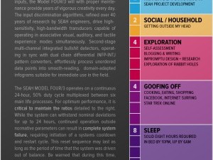
The Starting Visual Hierarchy
And here’s the final graphic once more:
This is not the visual design of a new website. It is a diagram that shows the relative importance of what needs to be on the website. And, it is a nutshell summary of what I am and what I’m doing.
My intention is to establish identity (Dave Seah, in the upper left) with a few key attributes about myself coming off right away (creative, weird, joyful, values first). Then next, there’s the idea of MAKING THINGS with IMAGES that entice people to explore further. It should be apparent that there are STORIES covering a range of interests, contained in an intriguing bundle somewhere that looks useful. It should also be apparent that this site is about CREATIVITY and SELF IMPROVEMENT, with a healthy emphasis on ACHIEVING CREATIVE INDEPENDENCE. Lastly, it should be apparent that there are things you can buy or download for free, and that it all is related to making, creativity, and a set of values and core principles that pervade every aspect of the website.
There is an ad-hoc color coding going on. The blue boxes represent “image heavy content”…something you can see, and then want to click on. The gray boxes represent text heavy content; the sort of thing someone might want to bookmark or read in depth. The magenta box represents something that is about “new and novel and inspirational” as a separate hook (perhaps a featured image or sticky post). Green boxes represent sales. The larger blue boxes under MAKER are larger images, perhaps anchoring a section. Red text represents CORE IDENTITY for me…the personal joy of expression that I want to exude. Lastly, the orange italic text is a reminder as to the kind of culture that I want to promote in my tribe and community.
This is not a bad starting place for visual design. I can now start to create mockups of some page designs, using the diagram as a guideline for layout, typography, and feature positioning. That will be what I tackle next week!

9 Comments
I have tried this same exercise many times through the ages and have always failed miserably. It takes a much more focused mind than what I seem to possess. Thanks for a template to try it again.
Mark: I should probably note that I’ve been trying to get to this point for the past seven years, possibly longer. So any advance you can make is probably a win.
I am blown away by this… I have been watching you make this journey for the better part of those 7 years, and it occurs to me that you are on the cusp of something really transformative for you!
Also, the cynical and commercial part of me thinks that you could make a good deal of money coaching people through this process, working with them to create a diagram like that for planning their life, career, education, etc.
Truly a living brand … in it’s fullest sense
Aargh. After all that work, the final graphic still looks confusing to me. My eyes still don’t know where to start and jump in.
While it’s a nice process, the main problem I have with it is that it doesn’t appear to consider very much what your audience might be looking for. Not only are YOU multifaceted, Dave, but your audience may also be multifaceted. Some might love you for your business insights and productivity tools. They might not care too much about your shared joy and shared values and stories. Others might be interested in reading about your quirkiness, creativity, and introspection on your inward struggles.
Stephen: Thanks for the thoughts. Also an interesting idea for coaching people through the process. Maybe this can be a variation of Live Design Sessions.
Laurie: Heh, that’s an interesting observation.
Posco: If I added more contrast and space, I think might work better for you. As I said, this isn’t intended as the interface for an AUDIENCE, but is for establishing what the visual hierarchy should be. You’re getting a bit of behind-the-scenes thinking here.
Your observation “this doesn’t appear to consider very much what [my] audience might be looking for” seems like you didn’t look at the diagram. Each of the facets you describe are still there: quirkiness, creativity, etc. We might be disconnecting on how we view the diagram or the context of it’s use. I’d be interested in what alternative actionable approaches.
The diagram might make more sense if you see the Day 5 article. This is in turn based on a week of thinking about audience, which is collected here.
I know your journey. I am copywriter, but also strategist, graphic designer, web designer, typesetter, programmer. This is confusing for prospective clients. They want an expert, but we are kind of multipurpose-one-man-agencies. Once clients see my abilities or experiences – or whatever you what to call it – they get enthusiastic. What puzzles me: They hardly see the real benefits of my holistic approach and the strategic thinking behind the scenes. So they reduce me to “the copywriter” or “the designer”. I don’t like the word “communication designer” too much because is associated mainly with graphic or motion graphics design. Interestingly some of my clients are graduated communication designers. They all work as product managers, but I have never met one who did successfully the creative thing.